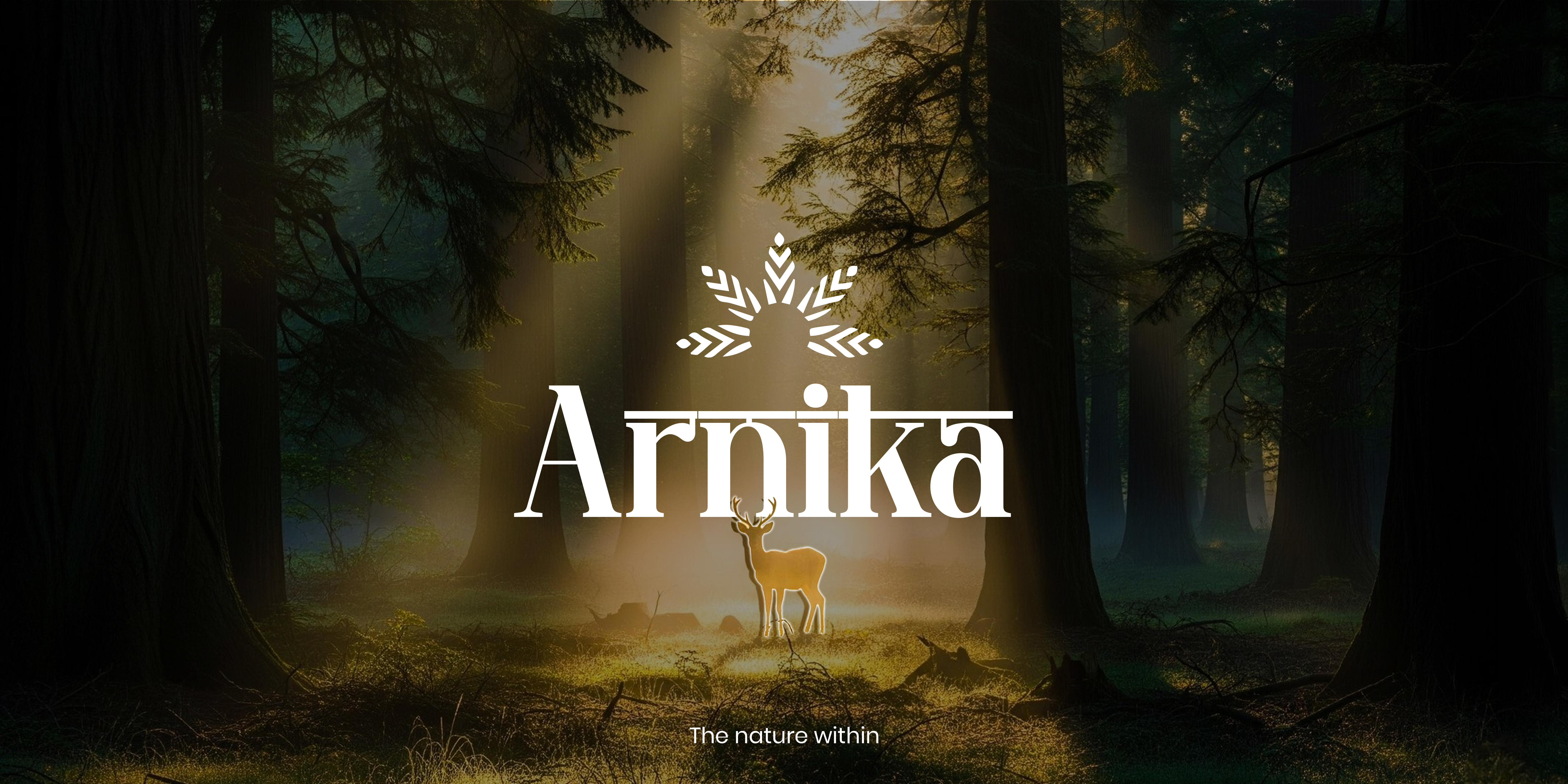
Rooted in nature, crafted for modern wellness.
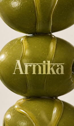
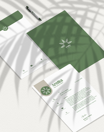
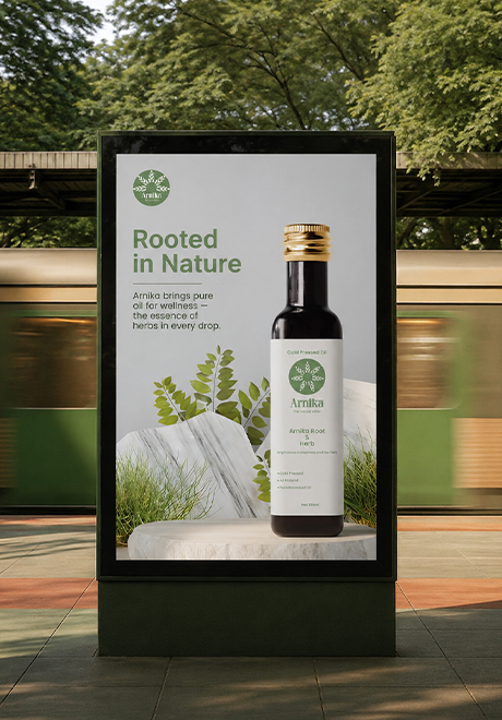
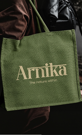
Arnika is a herbal wellness brand inspired by the healing power of nature. Built around purity, balance, and traditional botanical wisdom, it offers natural oils and remedies for everyday well-being. The identity blends organic forms, earthy tones, and clean typography to create a brand that feels authentic, calming, and trustworthy—bringing nature's goodness into modern lifestyles.



From concept to a timeless identity.
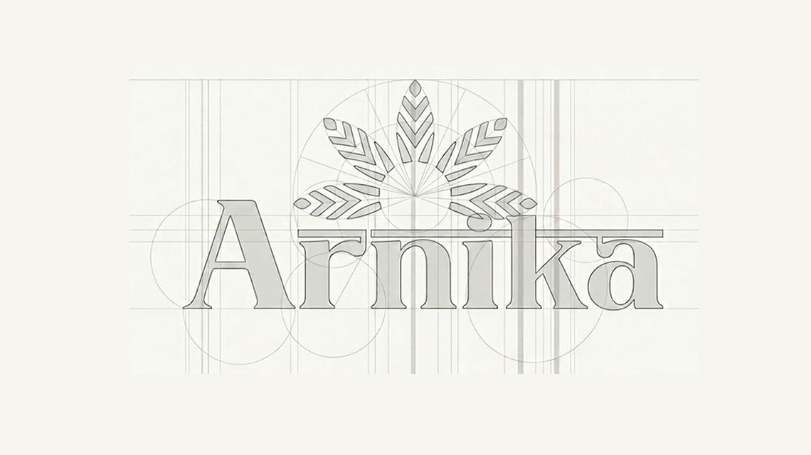
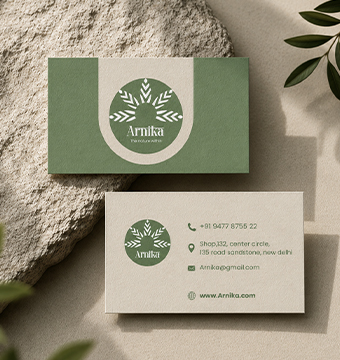
The Arnika logo began with simple geometric guidelines and botanical sketches inspired by leaves and natural growth. Through multiple refinements, the symbol and wordmark were balanced to achieve clarity, symmetry, and versatility. The final mark reflects the brand's values of purity, wellness, and harmony while remaining recognizable across both print and digital applications.
Basgira
SERIF DISPLAY · REGULAR · HEADLINES & LOGOTYPEPoppins
SANS SERIF · REGULAR · BODY TEXT & DESCRIPTIONS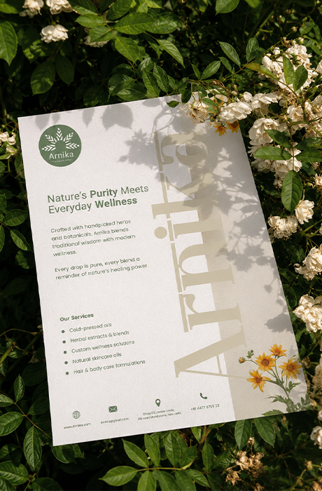
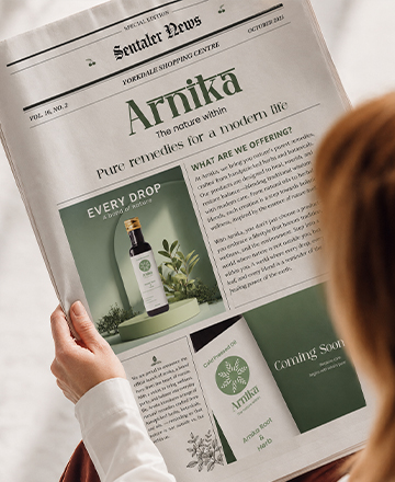
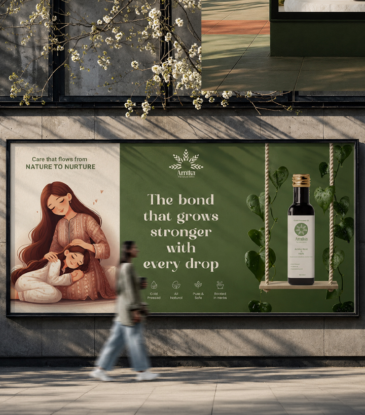

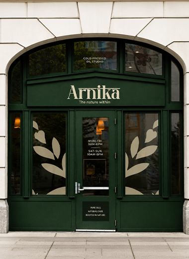
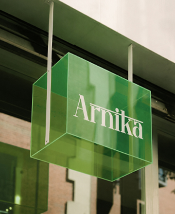
Designed to educate, inform, and strengthen the brand experience.
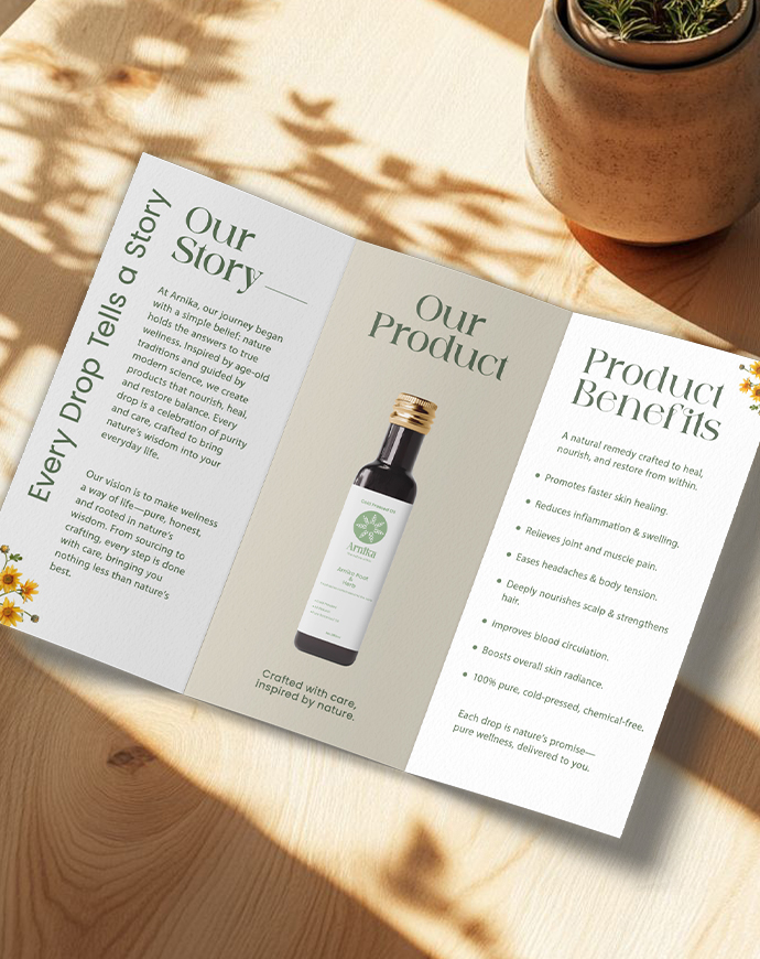
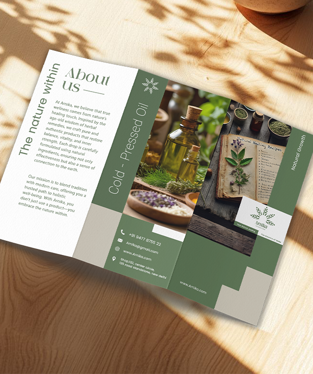
The Arnika brochure extends the brand beyond the product by sharing its story, values, and benefits in a clean, nature-inspired layout. It combines elegant typography, botanical imagery, and a calming color palette to create an informative piece that builds trust while reflecting the brand's commitment to natural wellness.
The brochure is designed with a clear visual hierarchy, making product information easy to explore while maintaining a premium and approachable feel. Every spread reinforces Arnika's identity, ensuring a consistent experience across both print and brand communication.